
“A stag’s feed, a serpent’s head, a leopard’s body, and a lion’s thighs and tail.”
McShane, K. L. “The Questing Beast.” Robbins Library Digital Projects. rochester.edu
This mythical description betrays this animal’s origin1: Arthurian legend, but I guarantee that you are familiar with this so called “Questing Beast.” If not seen physically in zoos, then you have undoubtedly seen them illustrated in children’s books, filmed in nature documentaries, and paraded on rides in Disney parks. Perhaps their accessibility has produced a familiarity that contradicts the animal’s incredible features; similar to how post cards of the Grand Canyon spoil the wonder of simply stumbling upon such great, unexpected nature.
1. By origin, I mean introduction to the western world.
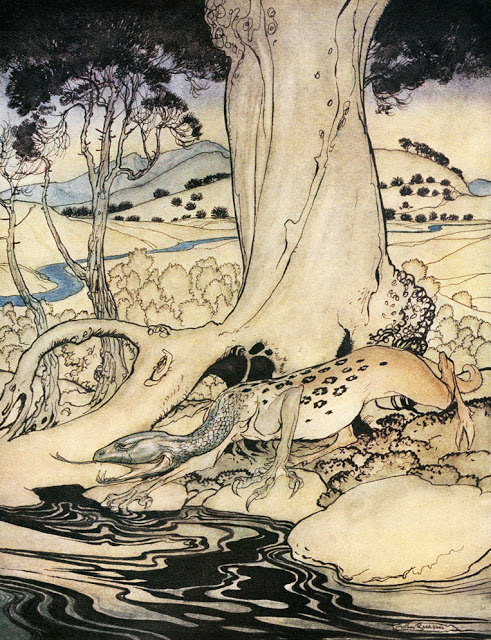
Any guesses to the name of this amalgamation of animals?
A long neck like a snake, a printed body like a leopard, and seemingly unstable legs like a deer…it’s a giraffe! In truth, the image above was a recreation made by Arthur Rackham in 1917 (although it is based on a description from the Prose Tristan, likely written in the early 13th century). The horrific image was not the norm of the time, but rather a literary embellishment meant to convey the evil nature of this beast supposedly born from the devil impregnating an incestuous woman. Early illustrations of giraffes are surprisingly quite identifiable.
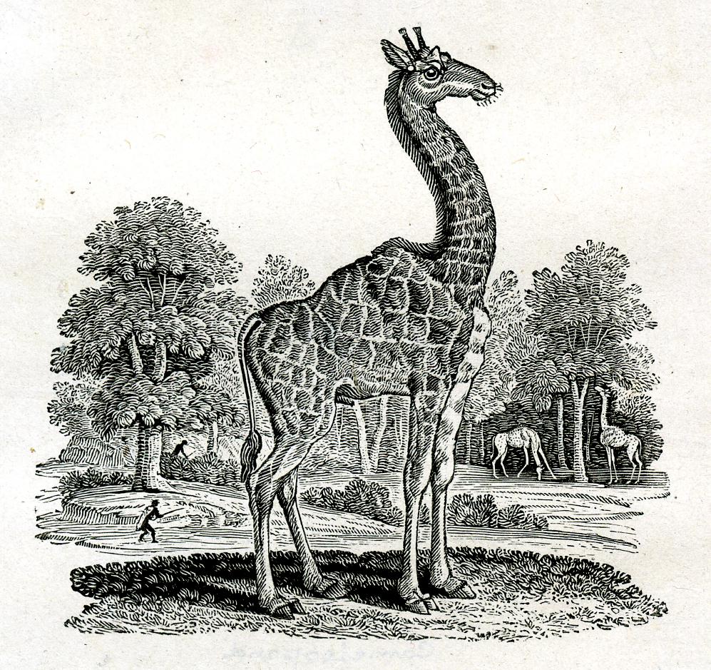
Taken from Thomas Bewick’s A General History of Quadrupeds (1790), this giraffe rendition has a notably lumpy back. The hump is no mistake, it is from medieval bestiaries which viewed giraffes as a combination of camel and leopard, leading to the name camelopardalis (which has stuck to the animal even today through its scientific name Giraffa camelopardalis). Bewick himself likely never saw a giraffe in person and neither did most artists who drew arguably more accurate depictions (see Vulcan and Aeolus from 300 years earlier). Far from being an oddity of history, copying and drawing from description alone was the norm for most scientific illustration until very recently. Perhaps most famously, Albrecht Dürer made a woodcut of a rhino without ever having seen the animal in person.
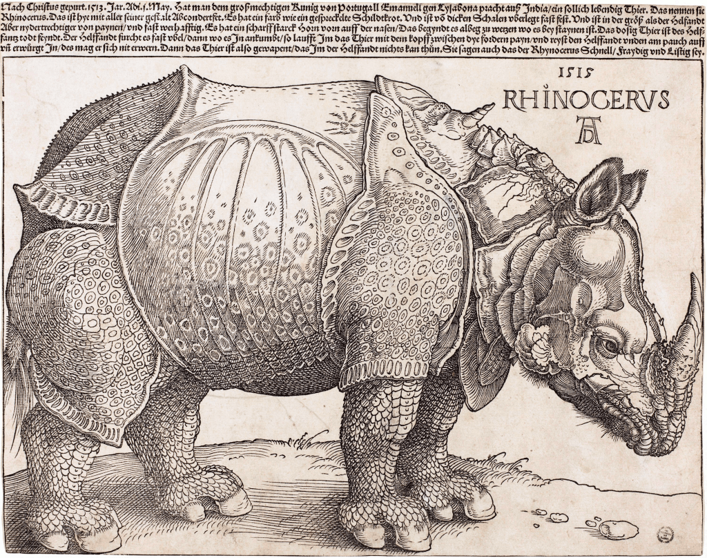
Thousands of prints were made and distributed across Europe of this armored rhino, exposing many to an animal that before was limited to kings and popes. Given only limited descriptions such as ‘like an elephant that sits closer to the ground,’ and an ‘aggressive being with tortoise skin,’ Dürer manage to capture the essence of a rhino. While it might seem that we as a people have progressed past this age of “inaccurate” scientific illustration, nothing is further from the truth. Our world is filled with things we will likely never be able to see and we must rely on descriptions given to us not by people but by data and experimentation.

Computer-rendered Coronavirus (Courtesy of the CDC)

Electron microscope image with Coronavirus molecules colored blue (Courtesy of the CDC)
The current depictions of the Coronavirus are “wrong” in similar ways that Dürer’s rhino was “wrong.” I do not mean to imply that the molecule is inaccurate (the scientists at the CDC used protein data to model the real shapes shown in the graphic above), but rather that there are stylistic choices that were made in order to communicate aspects of this otherwise foreign object. Dürer chose to exaggerate the plates of the rhino to communicate to the public the armored nature of the rhino while the scientific illustrators at the CDC decided to color the E, M, and S proteins to highlight their importance to the virus’s character. While not a 1 to 1 comparison, there are many other instances today in which illustrators need to make decisions that might contradict the reality of a subject for clearer communication or simply from a lack of knowledge. For example, paleo-artists (illustrators who imagine how prehistoric animals might have looked like) are frequently caught in this scenario deciding whether to draw feathers on dinosaurs or how to depict their behavior.
None of this is to suggest that you should be skeptical of all scientific illustrations (although the number of left-handed DNA helices displayed on textbooks is rather outstanding), but rather that you should view scientific illustration they way you view all art: with the artist and the intended spectators in mind.
If you want to learn more about how scientific illustrators designed the Coronavirus model I would recommend this article and this article for the CDC version.
If you are interested more about Dürer’s rhino, check out this two part series by the British Museum: Part 1, Part 2
Cuttler, Charles D. “Exotics in Post-Medieval European Art: Giraffes and Centaurs.” Artibus et Historiae, vol. 12, no.23, 1991.
Kuntz, Joëlle. “1515, the year of the rhino.” Le Temps, December 18, 2015.
McShane, Kara L., “The Questing Beast.” Robbins Library Digital Projects. rochester.edu/camelot.

_enhanced.png)